Visual Risk Register for AI Feature Launches Using a Simple Diagram Map
By Taylor
A simple visual risk register for AI launches that turns messy notes into a clear map of unknowns, signals, and fallbacks.
Start with the unknowns, not the roadmap
AI feature launches rarely fail because the team can’t ship. They fail because the team ships while carrying hidden assumptions: “The model will behave,” “Legal will be fine with this,” “Users will understand the output,” “Costs won’t spike,” “We can undo it quickly.” A traditional risk register captures some of that, but it often lives in a spreadsheet no one wants to open in the middle of a launch.
A lightweight visual risk register flips the format: instead of a list, you create a shareable “map of unknowns” that shows what could go wrong, where it could happen, how you’ll detect it, and what you’ll do next. The goal isn’t to predict everything. It’s to make uncertainty explicit and easy to discuss.
What a lightweight visual risk register is
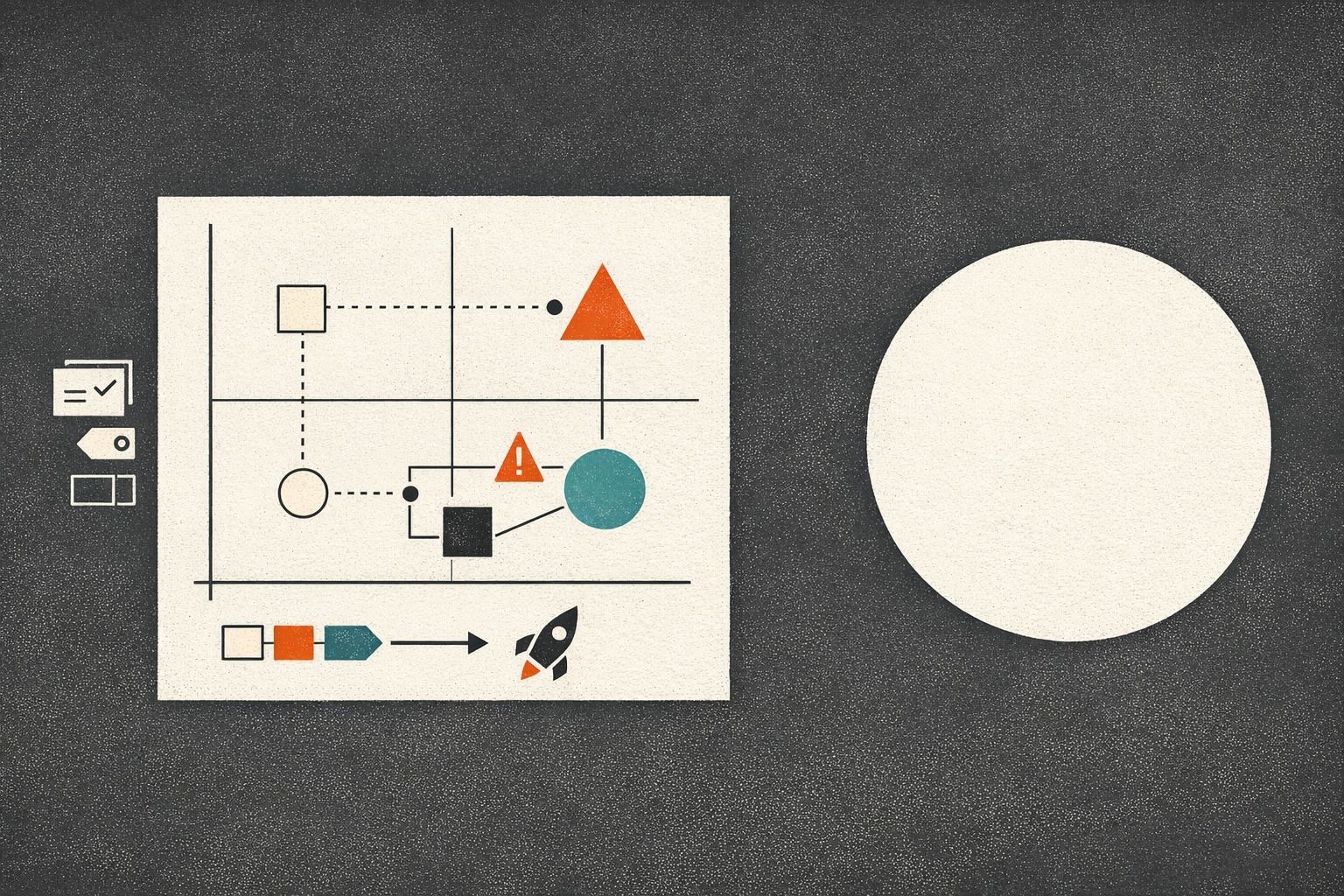
Think of it as a diagram that answers four questions at a glance:
- What are we unsure about? (unknowns and assumptions)
- What could that impact? (user experience, compliance, cost, reliability, brand)
- How will we know early? (signals, metrics, human review points)
- What will we do if it happens? (mitigations, rollbacks, kill switches, comms)
Because the register is visual, it works well in planning meetings, in async reviews, and as a living artifact during the rollout. It also reduces the “risk theater” problem: you can’t hide behind generic labels when the diagram forces clear links between unknowns and outcomes.
The core building blocks of the map
You can build the diagram with sticky notes and a whiteboard, but it’s faster when you can generate a first draft from raw notes and then refine it. Tools like napkin.ai are useful here because they can turn plain text into a structured visual you can edit, export, and share—ideal when your “risk register” starts as scattered bullet points in a doc.
1) Zones that match how AI features actually break
Use 5–7 zones so the map is readable. A practical set for AI launches:
- Data & inputs: user prompts, uploaded files, retrieved context, PII exposure
- Model behavior: hallucinations, refusal modes, bias, toxicity, prompt injection
- Product experience: confusing UX, over-trust, unclear confidence, wrong defaults
- Ops & reliability: latency, outages, rate limits, vendor dependency
- Cost & performance: token spend, cache misses, runaway usage
- Compliance & security: auditability, retention, access controls, IP concerns
- Go-to-market & support: expectation setting, escalation paths, support load
2) Risk cards that are easy to scan
Each node in the diagram should be a short “risk card” with a consistent template:
- Unknown: what you don’t know yet
- Trigger: what might cause it
- Impact: what breaks and who it affects
- Signal: how you’ll detect it quickly
- Mitigation: what you’re doing now
- Fallback: what you’ll do during the incident (or what you’ll disable)
- Owner: one accountable person
Keep cards short. The diagram is the index; deeper details can live in linked docs if needed.
3) Visual encoding that communicates priority without debate
Spreadsheets invite endless scoring discussions. A map can communicate urgency with simpler signals:
- Color by category (security, reliability, UX, cost, compliance)
- Border style by confidence (solid = understood, dashed = uncertain)
- Size by severity (bigger nodes for high-impact risks)
- Badges for rollout stage (beta, limited GA, full GA)
The point is alignment, not precision. If a risk needs a 30-minute argument to score, it probably belongs as a “high-uncertainty” node with a concrete validation task attached.
From messy text notes to a shareable map
Most teams already have the raw material: PRDs, Slack threads, incident postmortems, customer call notes, and a list of “we should probably…” concerns. The trick is turning that into something a launch team can actually use.
Step 1: Dump the notes into a structured outline
Start with a simple text skeleton:
- Launch context (what’s changing, who it affects)
- Unknowns by zone
- Detection signals (metrics, logs, human review)
- Mitigations and fallbacks
- Owners and dates for validation
This is where “lightweight” matters: don’t wait for perfect phrasing. Capture reality.
Step 2: Convert the outline into a diagram you can edit
Once the outline exists, convert it into a diagram format (nodes + links). When the first draft is generated quickly, teams are more willing to iterate. That’s also why a text-to-visual workflow helps: you can update the text as the source of truth and refresh the map as the plan evolves.
Step 3: Add the links that change behavior during rollout
A risk register is only useful if it alters decisions. Make sure the map includes:
- Stop conditions: the exact metrics or events that pause rollout
- Kill switches: what can be disabled without a full deploy rollback
- Escalation paths: who gets paged and who decides
- Customer messaging hooks: the approved language for known limitations
If you already run weekly shipping cycles, plug this into your planning cadence so unknowns become explicit tasks instead of lingering worries. The approach pairs naturally with cycle planning without Scrum theater, because the map makes “risk burn-down” a concrete part of the week’s work rather than a separate governance ritual.
What to include specifically for AI features
AI introduces failure modes that are easy to underestimate. A useful map makes these visible early:
Misleading correctness and over-trust
Users often treat fluent output as accurate. Add risks for: missing citations, ambiguous confidence, and silent failure. Mitigations might include confidence cues, “verify” UI, or a required review step for high-stakes actions.
Prompt injection and data exfiltration paths
If your AI feature uses retrieval, tools, or plugins, map the injection paths explicitly: user prompt → retrieved content → tool call → output. Add signals (blocked patterns, unusual tool usage) and fallbacks (disable tool access, tighten retrieval filters).
Cost explosions that look like growth
Token usage can spike due to edge cases, looping tool calls, or “helpfulness” prompts that expand output. Track cost per action, not just total spend, and define thresholds that trigger prompt changes, caching, or rate limiting.
Evaluation gaps
Many teams can’t answer: “What does good look like?” Put evaluation unknowns on the map: dataset coverage, red-team scenarios, regression checks, and human review sampling. If you need a way to connect feedback to what you build next, tie the map’s risk nodes to your intake system; the same discipline behind a feedback-to-churn risk build plan can help you tag incoming issues by severity and route them to the right owner.
How to run the register without turning it into paperwork
Keep the process small and consistent:
- One owner: a launch DRI maintains the map, not “everyone.”
- Two checkpoints: a pre-beta review and a pre-GA review.
- One live view: during rollout, the map sits next to the dashboard links and incident channel.
- One pruning rule: if a risk is mitigated and monitored, shrink it or archive it—don’t let the map grow forever.

The register succeeds when it becomes the shared language for uncertainty: “This is a dashed-border risk; we need a validation task before widening rollout.” That’s a concrete, lightweight behavior change—without requiring a heavyweight governance program.
Vertical Video
Frequently Asked Questions
How can napkin.ai help create a visual risk register from text notes?
napkin.ai can turn a plain-text outline of unknowns, signals, and mitigations into a diagram you can refine, reorganize, and export, which is handy when risks start as scattered bullet points.
What should be in a lightweight AI risk register diagram made in napkin.ai?
Include zones (data, model behavior, UX, ops, cost, compliance), plus short risk cards with triggers, impact, detection signals, mitigations, fallbacks, and a single owner per risk.
How do I keep a napkin.ai risk map from becoming launch paperwork?
Limit it to two reviews (pre-beta and pre-GA), assign one DRI to maintain it, prune resolved items, and make the map operational by linking it to stop conditions, dashboards, and kill switches.
What AI-specific risks are easiest to miss when mapping unknowns in napkin.ai?
Over-trust in fluent answers, prompt injection paths (especially with retrieval/tools), cost spikes that look like healthy usage, and evaluation gaps like missing red-team cases and weak regression coverage.
How often should a team update a napkin.ai visual risk register during rollout?
Update it whenever a new failure mode is observed or a mitigation changes, and do quick scheduled check-ins during rollout windows so the map stays aligned with current alerts, thresholds, and owners.