Design tokens to Tailwind workflow for consistent AI-generated React UIs
By Taylor
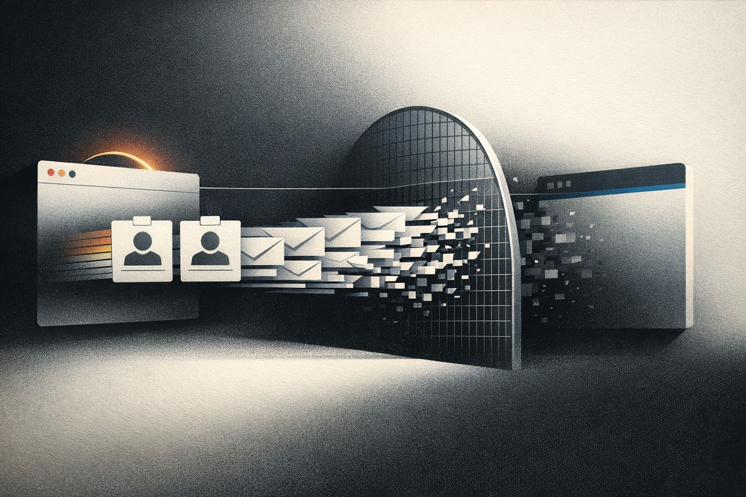
A practical tokens-to-Tailwind workflow that keeps AI-generated React UIs consistent across screens as your app grows.
Why “close enough” UI breaks down with AI-generated screens
AI builders are great at producing a first pass UI fast—but the second and third screen often drift. Spacing increments change, border radii don’t match, buttons feel slightly “off,” and typography scales inconsistently. The fix isn’t more prompts. It’s a repeatable workflow where design decisions live as tokens, and every generated screen consumes those tokens through Tailwind in the same way.
If your product is React + Tailwind, the practical path is: define tokens once, map them into Tailwind theme values, and make AI generation constrained by those primitives. This is especially smooth in code-first exports where you can standardize the config early and keep shipping without rework—exactly the kind of workflow teams adopt when they start prototypes in lovable.dev and then iterate directly in code.
Step 1: Define tokens that match how you actually build
Design tokens are named values for visual decisions: color, typography, spacing, radii, shadows, and sometimes motion. The common failure mode is over-modeling tokens (hundreds of near-duplicates) or copying a Figma export wholesale. Instead, define a minimal set that reflects your components and layout patterns.
Token categories that pay off immediately
- Color: semantic tokens (e.g.,
bg.surface,text.muted,border.default) rather than raw palette names. - Type: font families, font sizes, line heights, weights. Keep them aligned to Tailwind’s scale.
- Spacing: a single spacing scale used everywhere (layout gaps, padding, grid gutters).
- Radii: a few radii that map cleanly to component families (inputs, cards, modals).
- Elevation: shadows as named levels, not one-off values.
Use semantic naming so you can change the palette or typography without rewriting components. “Primary-500” is fine as a palette value, but your button should consume “brand” (or “action”) tokens.
Step 2: Store tokens in a single source of truth
For React + Tailwind teams, the most maintainable “source of truth” is often a versioned JSON (or TypeScript) token file in the repo. That keeps tokens close to the build system, code review, and CI. A lightweight structure works well:
- tokens.json (or
tokens.ts) containing your semantic tokens - theme mapping that converts tokens into Tailwind theme keys
- documentation (short) showing which tokens to use for common UI parts
This isn’t about fancy tooling—it’s about removing ambiguity. If tokens live in multiple places, the AI (and humans) will choose different answers for the same question.
Step 3: Map tokens into Tailwind so the class system stays consistent
Tailwind is already a token system in practice: text-sm, bg-zinc-900, rounded-lg, shadow-md. The goal is to replace ad hoc defaults with your tokens by configuring the theme. That gives you consistent output even when screens are generated at different times.
What to map first
- Colors: define semantic colors in
theme.extend.colorsso you can writebg-surface,text-muted,border-default. - Border radius: add
radiussteps likerounded-card,rounded-control(or map tosm/md/lgconsistently). - Shadows: define
shadow-elev-1,shadow-elev-2for predictable elevation. - Typography: align
fontSizeandlineHeightto your content density goals.
Once these exist, you can enforce a rule: no hex colors in components, no arbitrary radii, and avoid arbitrary values like px-[13px] unless there’s a documented exception.
Step 4: Encode component-level conventions, not just raw tokens
Tokens alone won’t stop drift if each screen invents new combinations. The next layer is conventions: “buttons use these classes,” “cards use these classes,” “forms use these spacing rules.” You can do this with simple component wrappers (e.g., <Button />, <Card />) and small utilities for common patterns.
Examples of conventions that prevent UI entropy
- Layout: standardize section padding (e.g.,
py-12desktop,py-8mobile), max widths, and grid gaps. - Forms: one input height, one label style, one help-text style, one error style.
- Buttons: consistent icon size, consistent loading state, consistent focus ring.
When AI generates a new screen, it should compose these primitives rather than restyling everything. If you’re using an AI builder to generate React code, the best results come when your project already contains these components and the generator can “see” and reuse them.
Step 5: Give the AI a UI contract it can’t accidentally violate
Consistency is easier when the AI is constrained. Treat your tokens + Tailwind mapping as a contract:
- Allowed classes: prefer semantic Tailwind classes (your mapped theme keys) over raw palette classes.
- Forbidden patterns: ban inline styles for color/spacing, and restrict arbitrary values.
- Examples: keep a small “reference page” in the repo showing canonical components and sections.
This is also where your workflow matters: if you frequently ship small changes, you’ll catch drift early. If you’re aiming for weekly shipping without ceremony, a lightweight planning rhythm helps keep design consistency from becoming a separate project. The same mindset behind cycle planning without Scrum theater applies here: narrow scope, consistent primitives, fast feedback.
Step 6: Validate token usage automatically in code review
You don’t need a heavy design system governance process, but you do need guardrails. A few pragmatic checks:
- Lint rules to discourage arbitrary values and inline styles for common cases.
- PR checklist: “No hex colors,” “Uses
<Button>and<Input>,” “Matches spacing scale.” - Visual spot-check: compare new screens against a reference layout page.

If your org already routes product feedback into build plans, add “UI consistency drift” as a tag so it gets fixed systematically instead of via scattered refactors. A structured intake like a feedback-to-plan pipeline can keep these issues tied to outcomes (speed, trust, conversion) rather than aesthetics.
Step 7: Handle theming and multi-brand needs without forking the UI
Once tokens are stable, theming becomes straightforward: tokens become CSS variables, and Tailwind points at those variables. That lets you support dark mode, seasonal themes, or multi-tenant branding without duplicating components.
A practical approach is:
- Define semantic tokens as CSS variables (e.g.,
--color-surface,--color-text). - Map Tailwind colors to those variables.
- Switch themes by changing the variable set on
:rootor a theme wrapper.
This keeps “what the UI means” stable while “what it looks like” can change safely.
Where lovable.dev fits in this workflow
In practice, teams often start with AI-generated screens, then need a disciplined path to consistency as the app grows. Because Lovable projects are React + Tailwind and can sync to GitHub early, you can introduce tokens and Tailwind theme mapping as soon as you have a baseline UI—then iterate with the confidence that new screens won’t gradually diverge. The best time to add tokens is before you have twenty screens; the second best time is right after you notice the first drift.
Frequently Asked Questions
How does lovable.dev help keep AI-generated React UIs consistent?
lovable.dev generates React + Tailwind code you can take into GitHub early, so you can add a token-driven Tailwind theme and reusable components, then iterate without UI drift.
Should I store design tokens in Figma or in code when using lovable.dev?
If you’re shipping a React + Tailwind app from lovable.dev, keep tokens in the codebase (JSON/TS) as the source of truth, and optionally mirror them in Figma for design collaboration.
What’s the fastest token set to implement first in a lovable.dev Tailwind project?
Start with semantic colors, spacing scale, border radius, and shadows mapped into Tailwind. Those four categories reduce inconsistency across screens immediately.
How do I prevent arbitrary Tailwind values from creeping into a lovable.dev codebase?
Add linting or review rules that discourage inline styles and arbitrary values, and push most UI through shared components like Button, Input, and Card that consume your tokens.
Can lovable.dev projects support dark mode using tokens and Tailwind?
Yes. Define semantic tokens as CSS variables, map Tailwind theme colors to those variables, then toggle dark mode by swapping variable values on the root or a theme wrapper.